KALIBR.

INTRODUCTION

Most hospitality brands fail at the handoff between identity and environment. A great logo. A disconnected space. A digital experience that feels like it belongs to a different business entirely. The brand feels thin. The customer feels it.

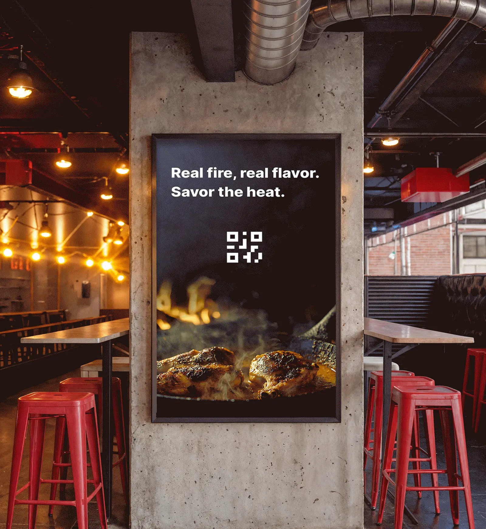
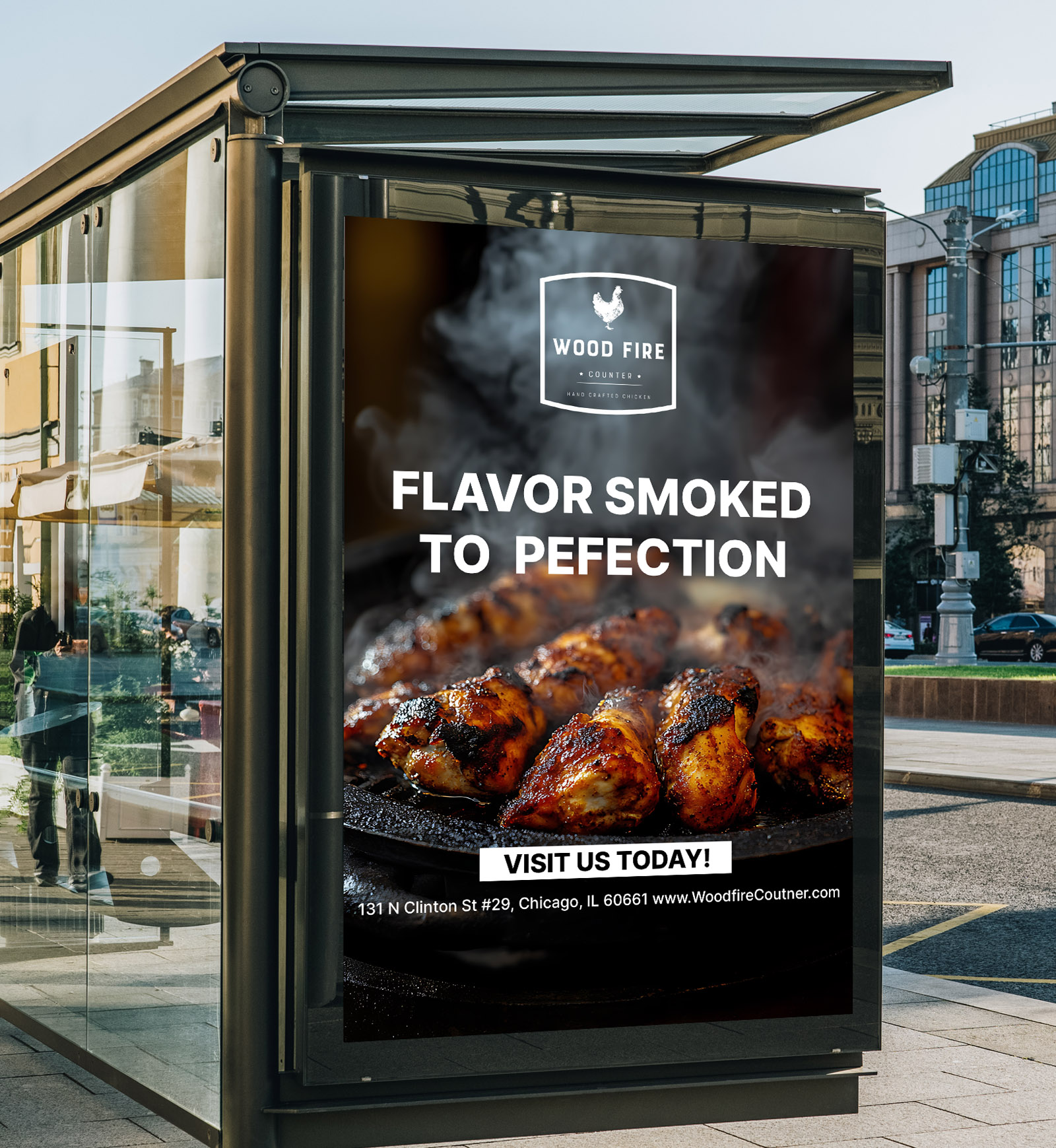
Woodfire Counter was built to be different. A contemporary dining concept rooted in sensory experience, where the warmth of the kitchen had to survive the transition into every touchpoint the brand would ever own.

Brand System Strategy
Visual Identity
Print
Digital Experience
Environmental  Design
Advertising

Woodfire Counter environmental design — branded window graphics with visual identity applied
Woodfire Counter stationery and menu mockup — clipboard menu, envelope, business cards, and branded notepad with visual identity system by Kalibr Studio
Woodfire Counter website — digital experience design showing brand system and interface

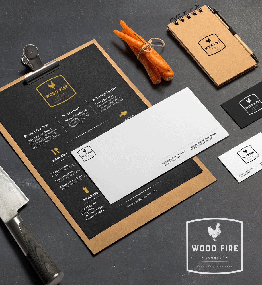
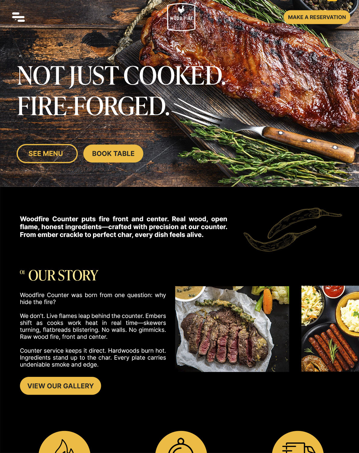
We built a system where language, spatial rhythm, and digital flow operate as one. Not just a menu. A unified design logic governing everything from environmental graphics to interface design. A concept built for scale. Sensory intimacy meets high fidelity execution. From a singular idea to a repeatable high-end experience. A cohesive identity. Singular craft. Total spatial alignment.

Woodfire Counter A-frame street signage — environmental design with brand identity applied
Woodfire Counter digital menu display — environmental graphic design for contemporary dining concept

Smoke signals hunger. Flame forges flavor. Coals deliver depth.

Woodfire Counter food photography — grilled dishes with smoke and char, brand art direction
Woodfire Counter advertising — brand campaign for wood-fired dining concept by Kalibr Studio
Contact Kalibr Studio on WhatsApp